Skilligy App - Logo design
Overview
Skilligy, is a skills platform based in India. They were looking for a logo for their app and visual design for typography. Here is the logo design process for this application. I have put up the process of logo design that I followed and the philosophy behind finalizing the logo.
Role & Duration
Visual Design, Graphic Design. Typography
Jan 2018 - Feb 2018
Team
Freelance project - 1 Visual designer
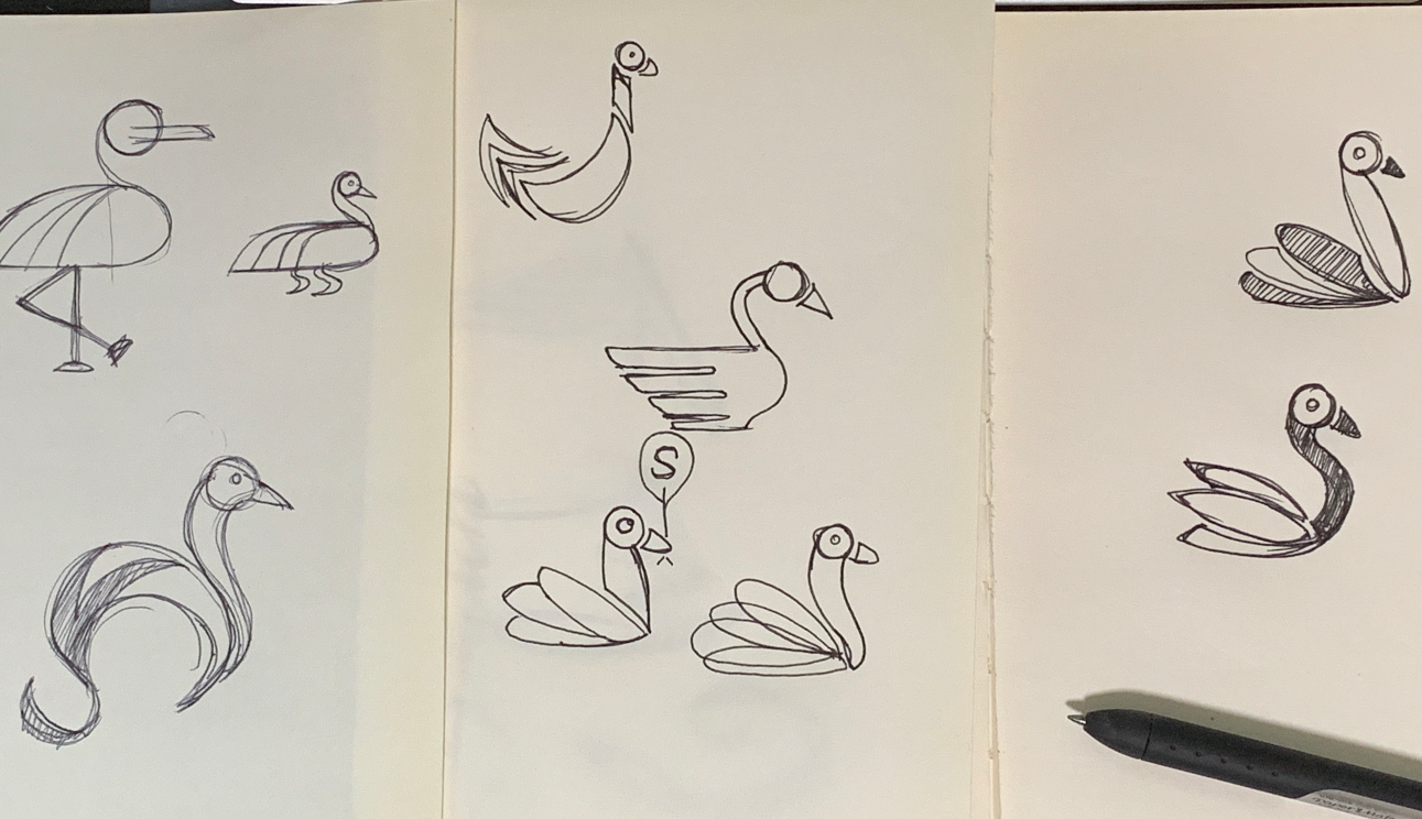
The thought process behind the logo design was to give it a simple and a elegant look of a black swan. The black color represents about isolation / under-representation of skills that people have. Nine out of ten times the user do not a get a platform to share their skills or explore special skills within them. The black swan with color feathers try to depict the dream of a black swan to have colorful feathers to let their skill gain the required attention. It provides a mix of Red and Blue feathers - red symbolizing - prosperity and good fortune whereas blue representing coolness, freshness and uniqueness.
Here is how - the initial sketch on paper started, the idea of starting with a bird came up as birds have a particular characteristics for their shape and colorful feathers.
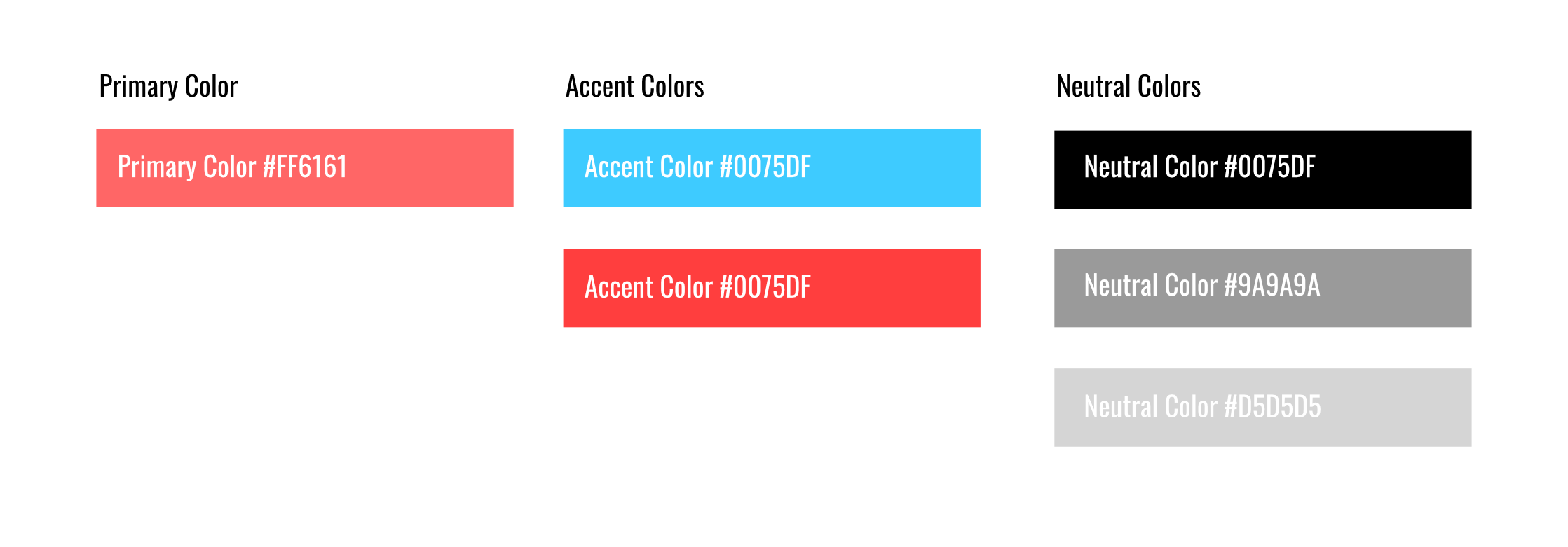
Color Pallette
Color pallete for the Skilligy App - the colors repesent the logo.
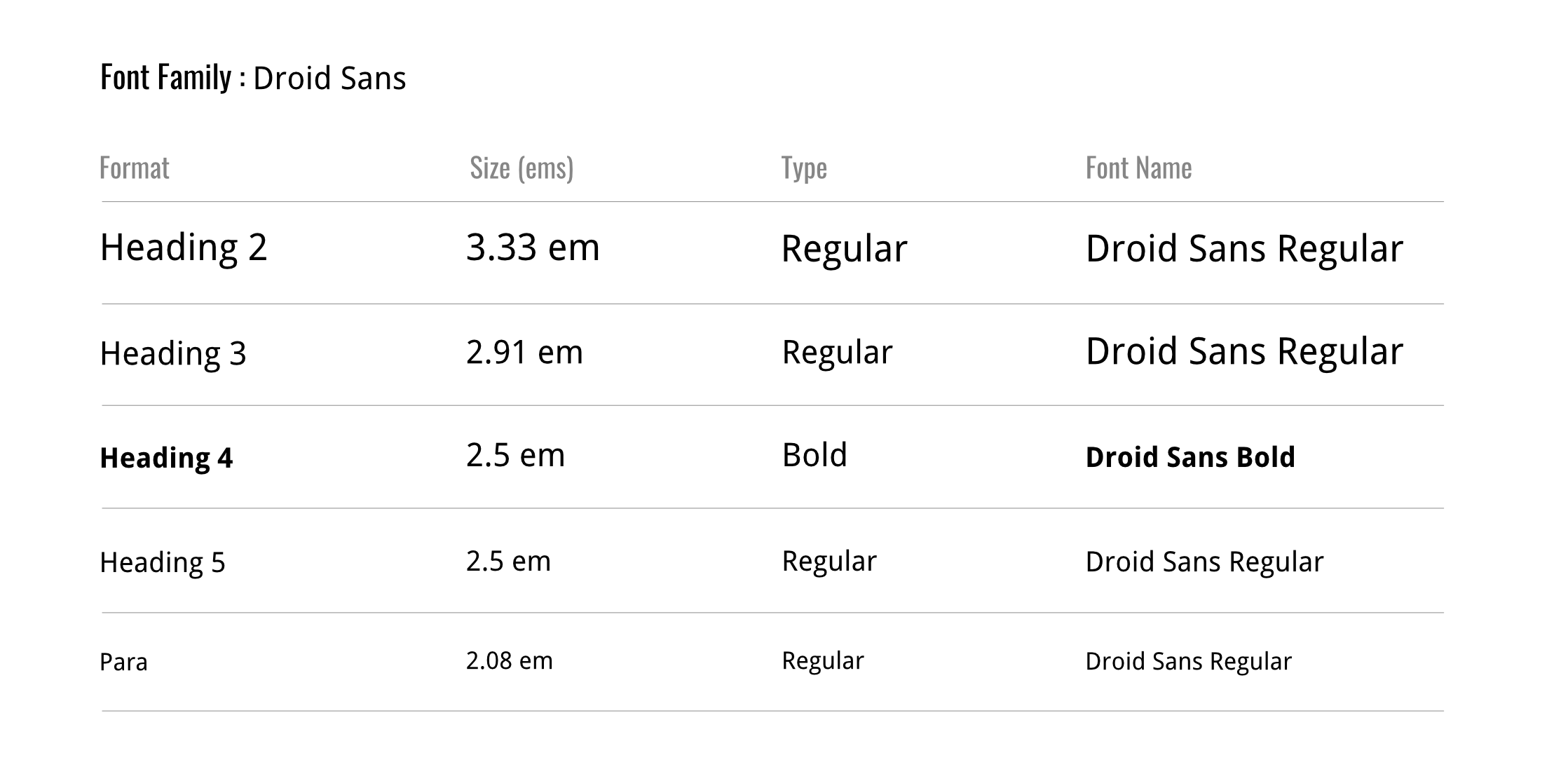
Typography
The font selected for Skilligy was Droid Sans regular/bold - for the clean and simple type. Here is the example of typeface.
Iconography
Listed below are the icons used in the app design - all these icons are from Fontawesome resource. I am displaying these as they are the part of the UI design for this project.

ABHI HUPARE | SIMPLOGIST
Contact - abhihupare@gmail.com